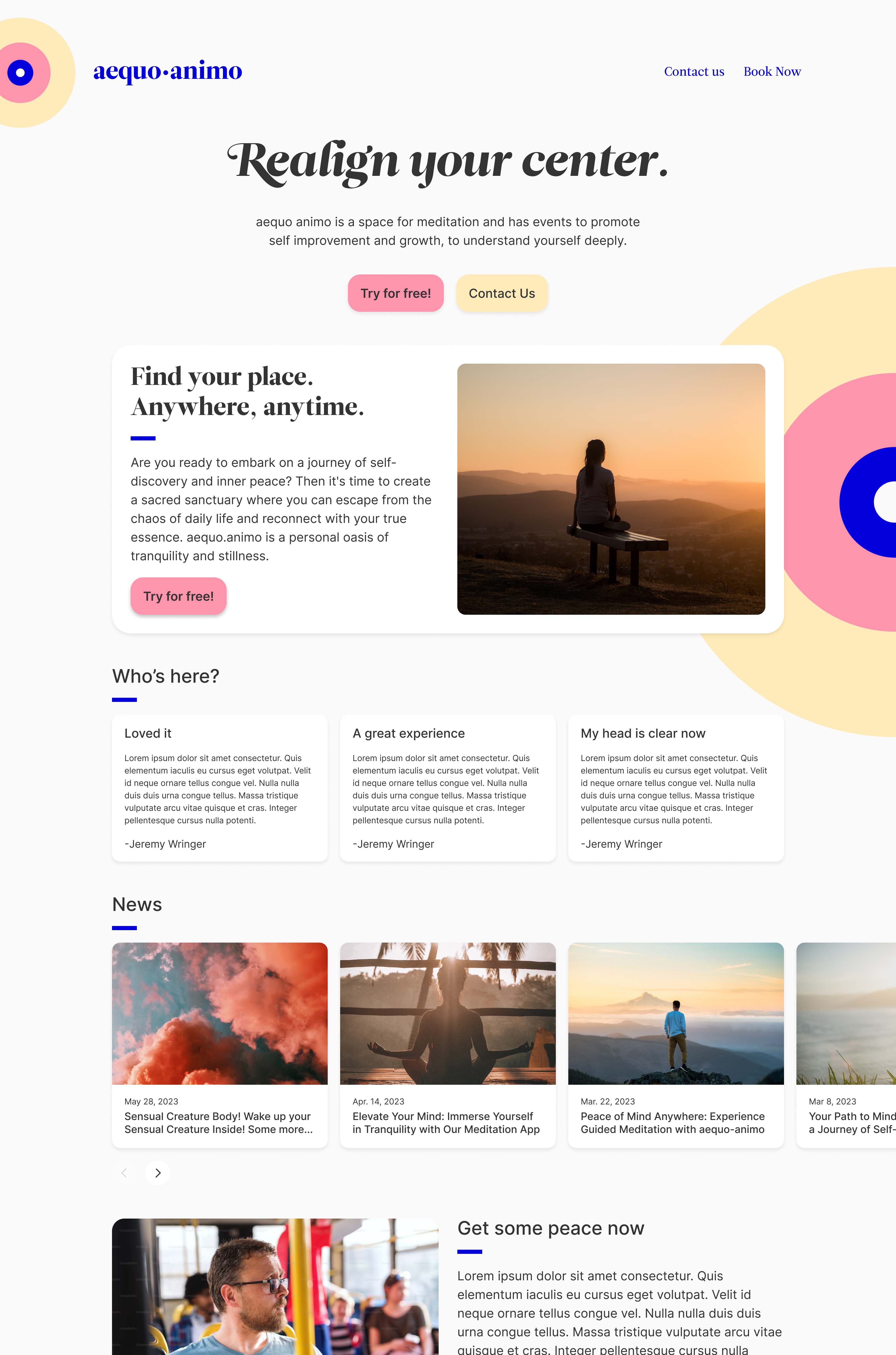
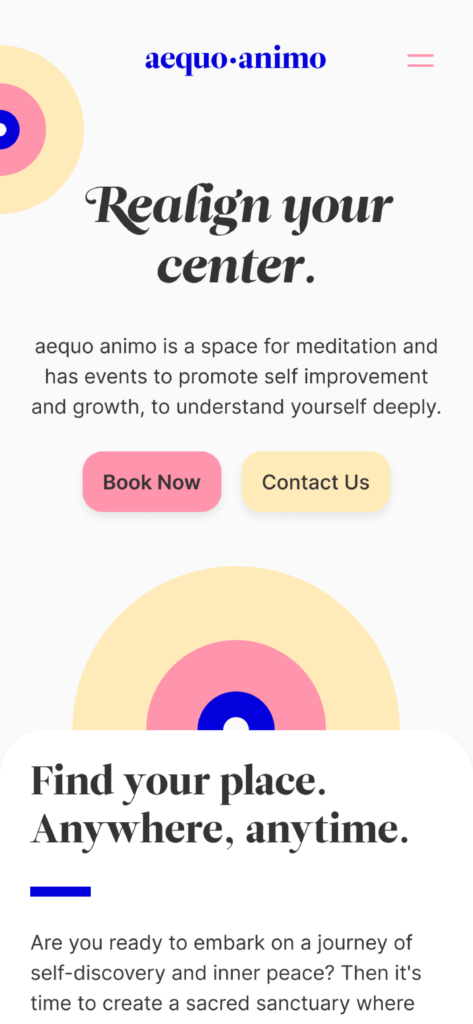
aequo-animo was created as a meditation space software designed for busy people. It can be used during brief periods of time, like a bus ride, to receive custom tailored meditation techniques and auditory guidance to realign yourself. I was responsible for designing the homepage, branding, and the UI of the scheduling pages. aequo animo is latin for finding peace.
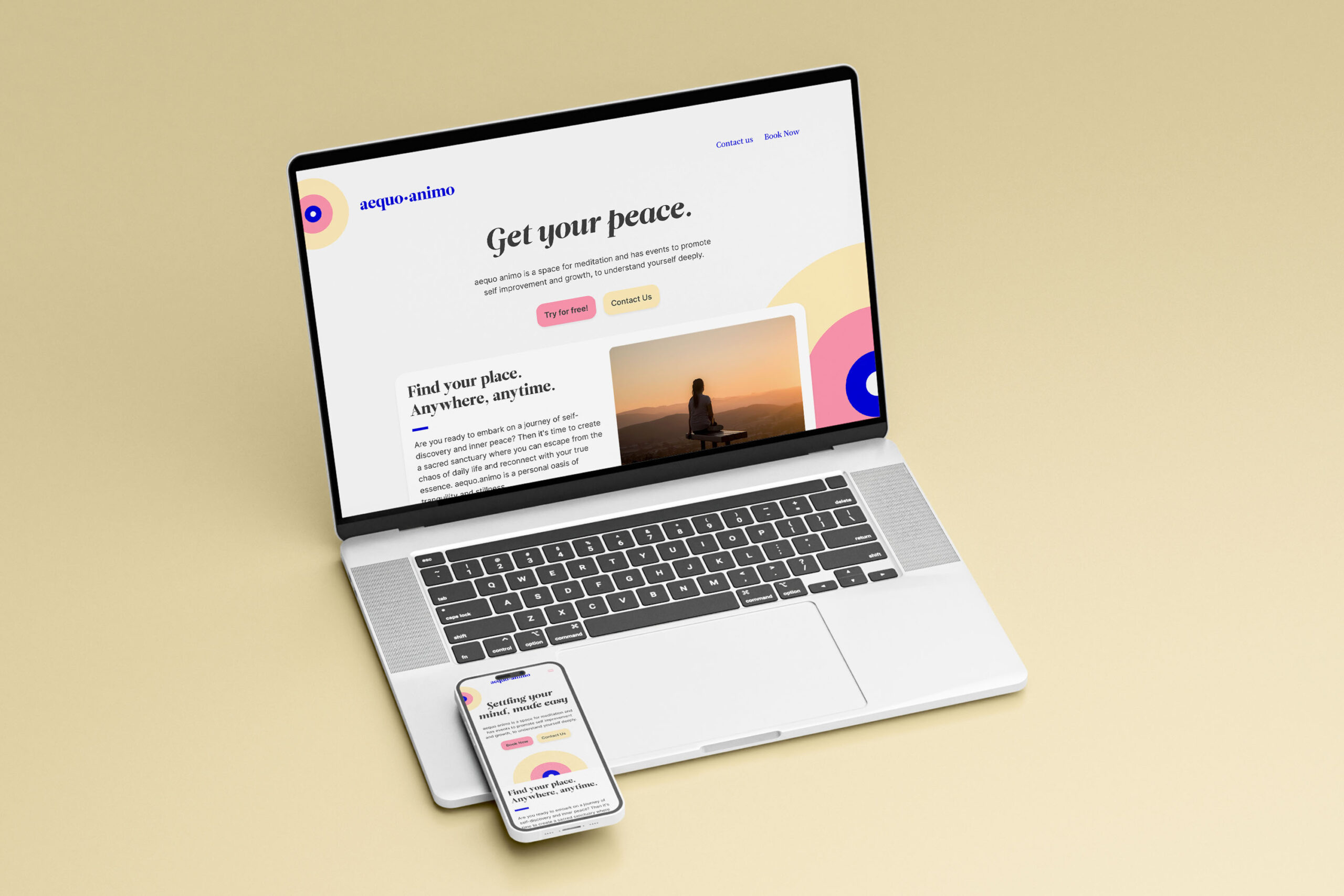
Branding
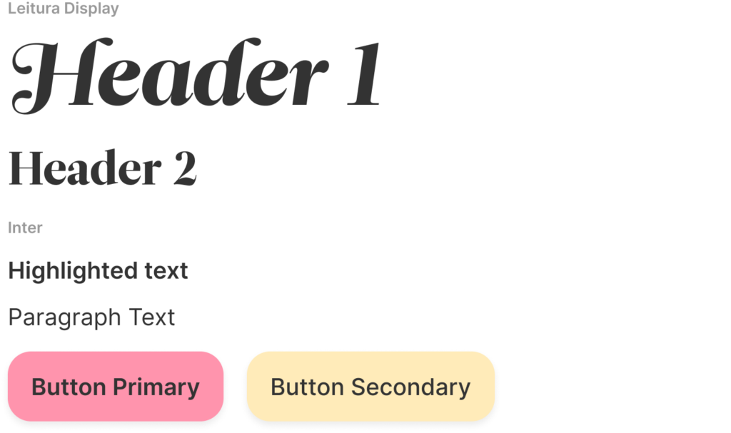
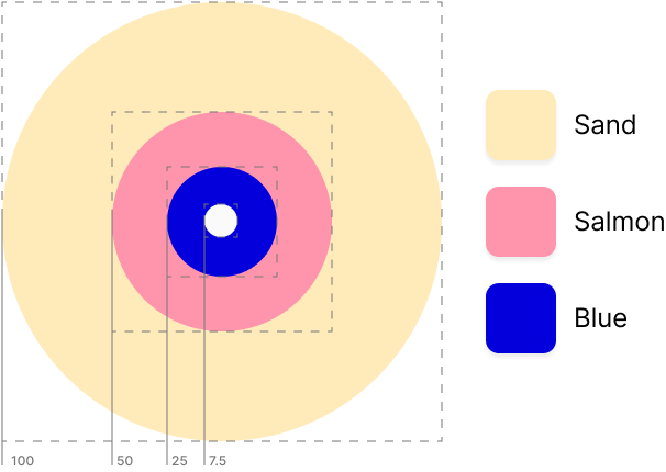
Colors
Sand
Chosen for its calming relaxing feeling and to remind the viewer of sunshine and the beach, this color serves to give an overall brighter tone for aequo animo.
Salmon
This color incites warmth, and is a color that best represents care and loving. This is placed around the outside of the center as a way to divide the beige and blue colors.
Blue
This is the core color of the Turkish evil eye, something that suggests protection and warding. At the center of the logo, is without the black dot as to leave it open and lighter.
