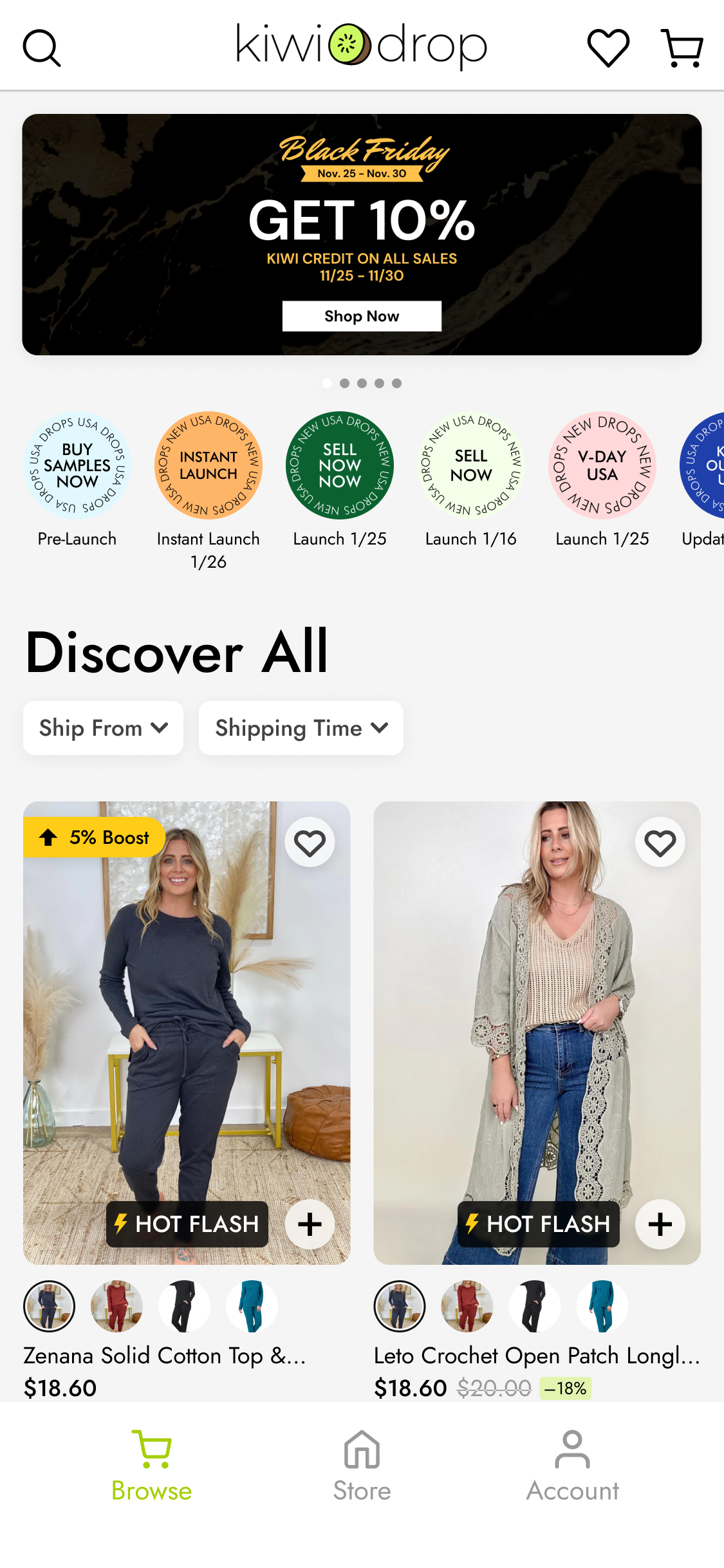
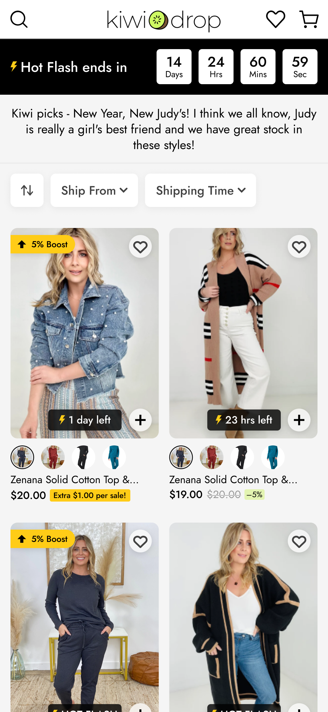
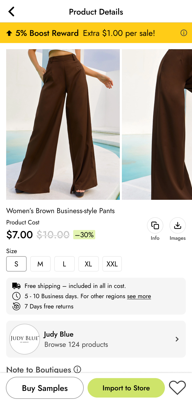
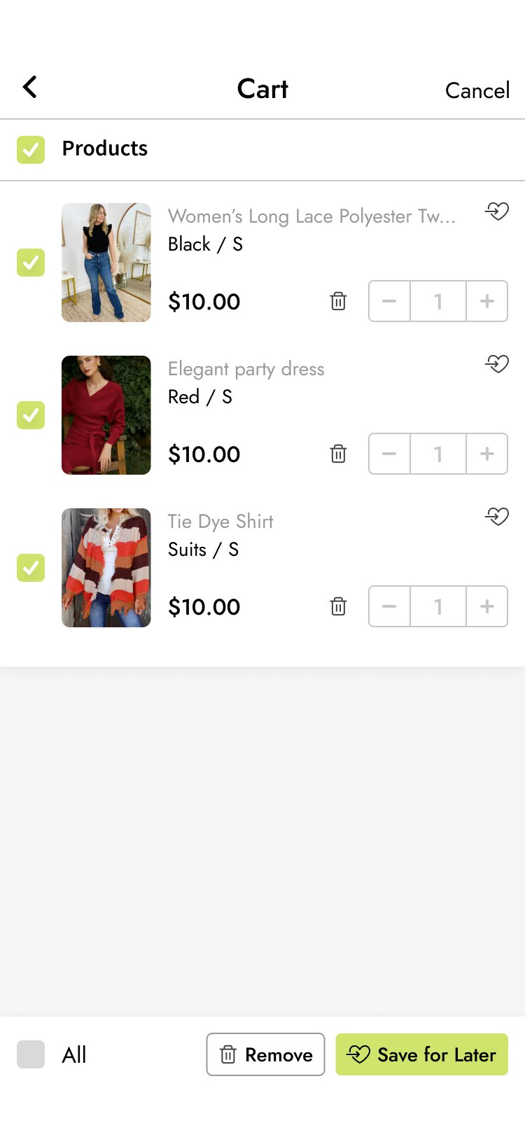
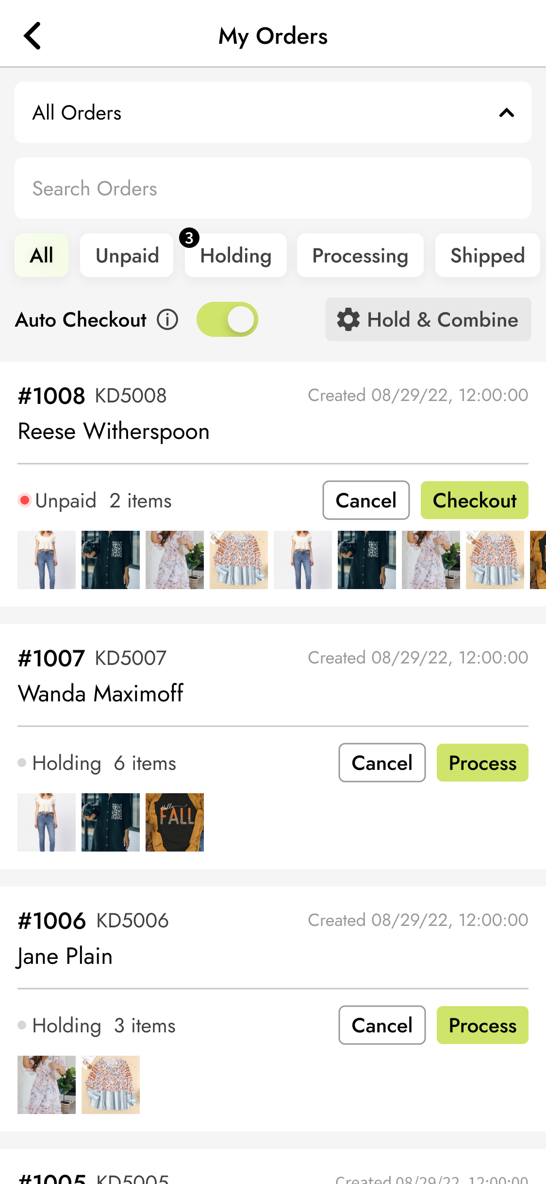
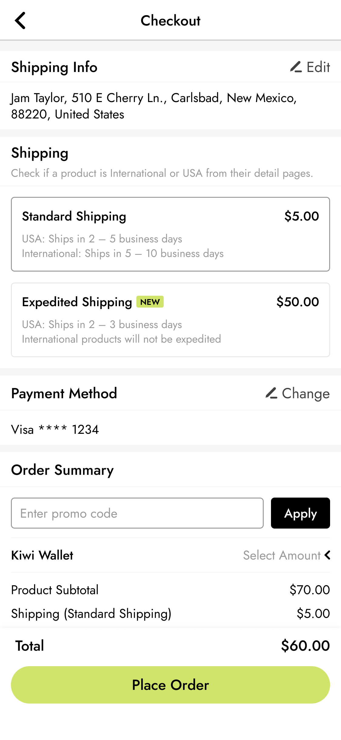
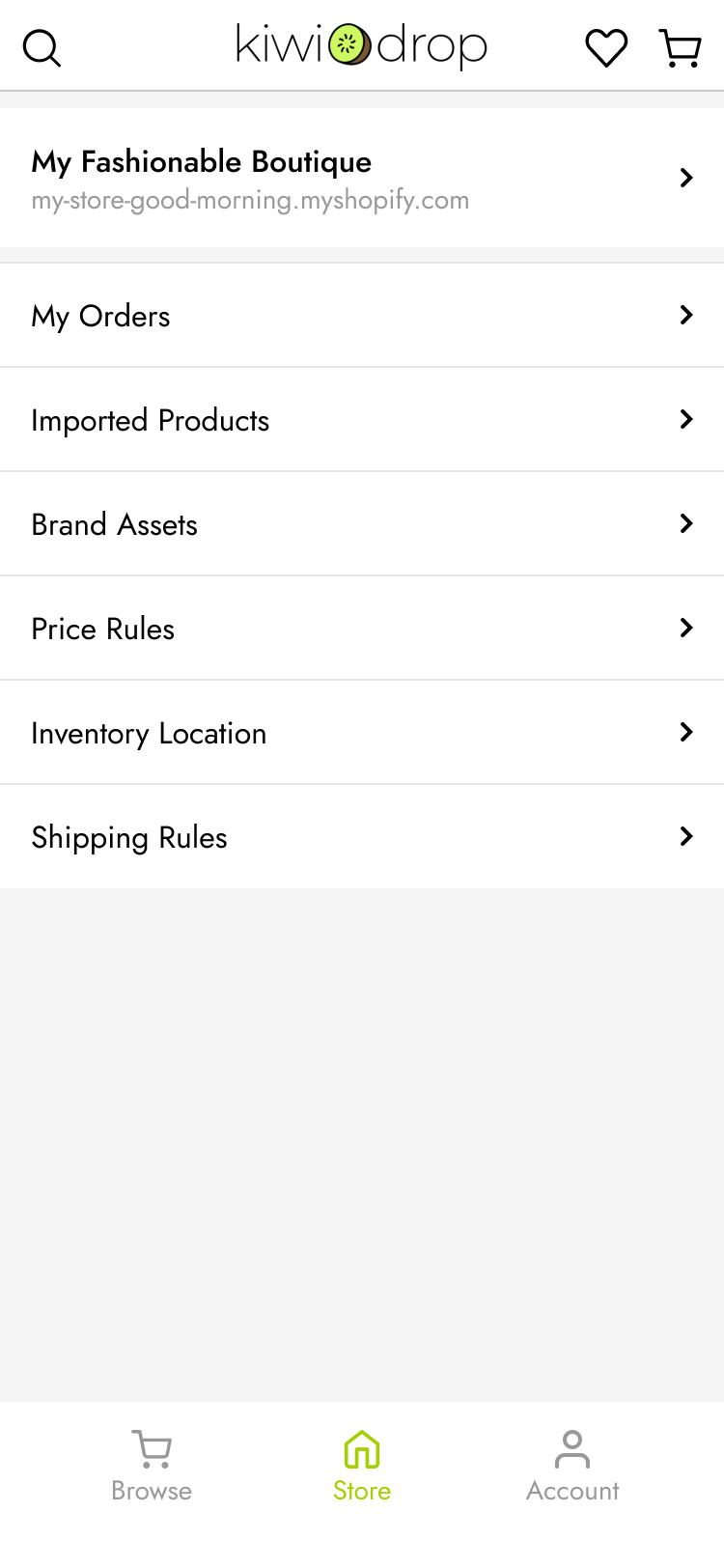
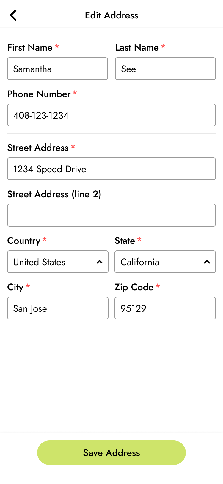
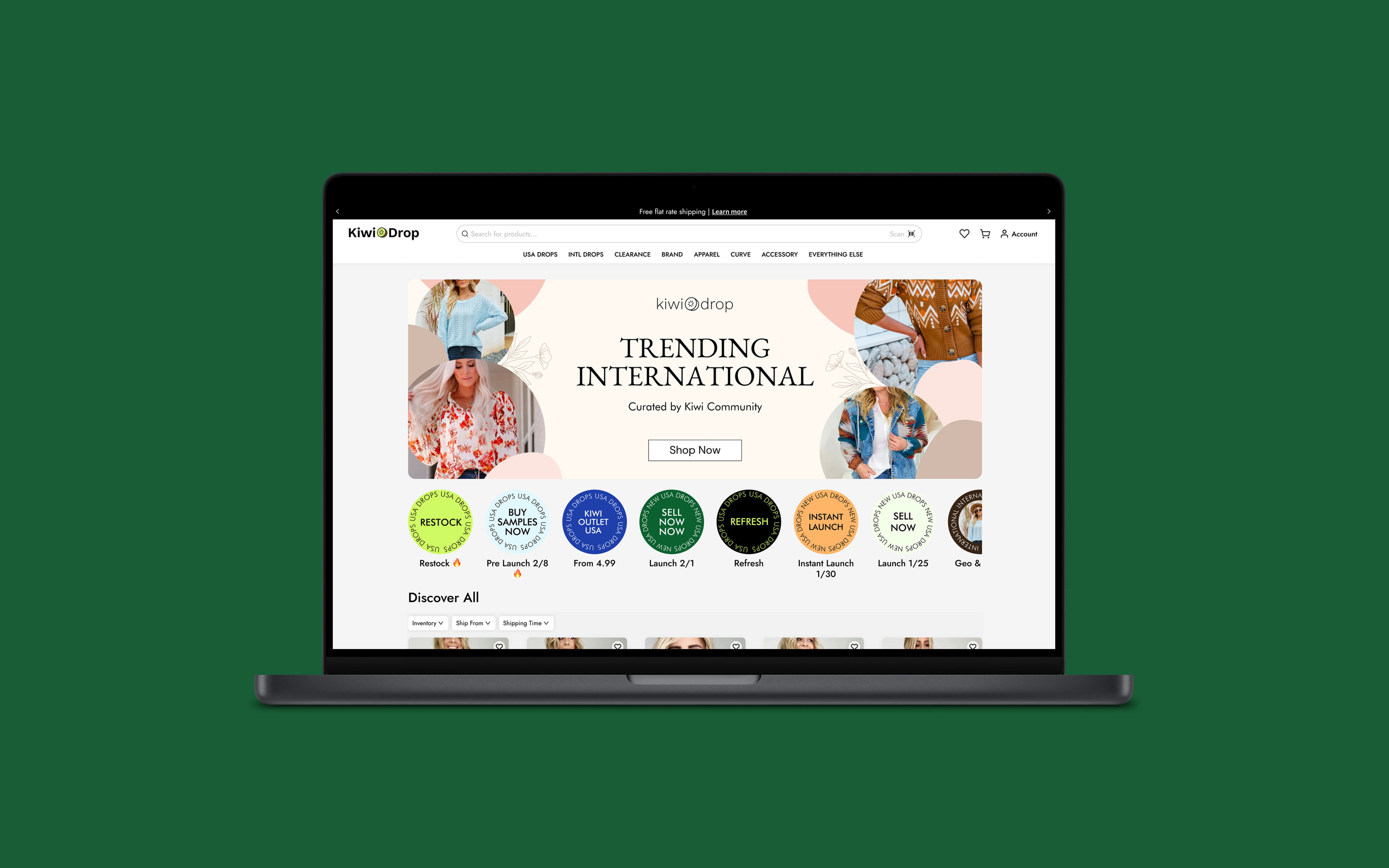
Kiwidrop is a B2B ecommerce platform, built for both web and mobile, created to support the needs of small to medium businesses that focus on fashion. As the lead designer for KiwiDrop, I was responsible for the product design of the app. Working closely with the cofounders and frontend/backend engineers, I was able to bring this vision to life. The result was an app that streamlined the B2B E-commerce process and provided a seamless user experience for our clients.
Tools: Figma, Illustrator, Photoshop, Shopify
Together with the CTO and development team, we created a user-friendly app that met the needs of our B2B clients. The landing page was designed with a sleek and modern look that would attract potential customers and give them a sense of the app’s functionality. To ensure the app was intuitive and easy to navigate, I conducted extensive research on user interface design. This included identifying the needs of the target audience, as well as exploring various design patterns and user flows. Ultimately the company was acquired in early 2024.
My Role
I led the design of the user interface and the user experience design for our app between 2021 and 2023, with the idea that our initial clientele would be small-to-medium fashion businesses. The goal was to target those who were either affected by Covid directly, such as those who had recently lost their jobs in brick and mortar retails, and people who were interested in starting an online boutique, as those were slowly rising.
Kickoff
We had an initial idea of how to structure a B2B application centered around the rising e-commerce, but to build confidence, I did a deep dive on potential competitors to spot their points of difference. Working alongside data scientists, I was able to pinpoint key reasons as to why successful sites were gaining traction and purchase rates. The main key insights were product placement, or how products were shot and presented, giving opportunities to quickly add items to the shopping cart.
As we we’re building from the ground up, there were a few things to consider, what would make our MVP stand out? How would we drive customer acquisition and furthermore customer retention? There were many other challenges, but I had to tackle the core of my challenges, which was how do I make our app give our users delight in a unique way?
Styles

Background
F2F2F2

Error
FF5050

Warnings
5A6B18

Primary Accent
CEE46A

Secondary
5A6B18

Text
111111

Mobile Screens
Some examples to showcase the mobile layout
